The volume of data collected during clinical trials is steadily increasing due to the rise in off-site data collection tools and the need to gain more insights into the effect of new drugs early in development.
However, data itself is not inherently informative; data is simply a collection of individual observations from which information must be extracted. While mathematical (statistical) methods can be used for extraction, they often require some type of modeling (data distributions, hypotheses, etc.) which can introduce bias and create data analysis gaps. Another option is through graphical visualizations, which have much less bias and do not require extensive modeling. These visualizations enable detection of trends early in the data collection process, even trends that were not anticipated. Graphical visualizations are therefore essential in gaining insight into the data at any stage of clinical development.
Graphical Visualizations vs Data Tables
One critical aspect of data cleaning is identifying data points that deviate from expected data patterns (e.g., outliers, incorrect entries, etc.). Detecting these points from raw data listings is tedious and can be unreliable, especially when data from different parameters are mixed within the same table. Consider Table 1, which contains an outlier. Can you spot it within 15 to 20 seconds?
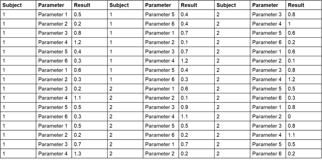
The challenge with Table 1 is that it combines various parameters, making it difficult to assess the range for each and identify deviations. Sorting the data by parameter and displaying each subject in a separate column (as shown in Table 2) can simplify the process. Can you now find the outlier in Table 2 in 15 to 20 seconds?
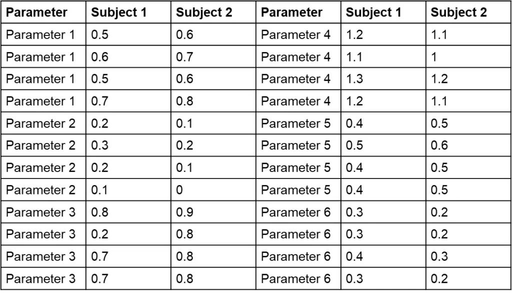
You may have found it challenging to identify the outlier in Table 1 within the given timeframe. This exercise underscores a common issue in clinical data review. We understand that manually scanning through unsorted tables can be time-consuming and prone to oversight, especially when working with extensive datasets.
Table 2 demonstrates an improvement over Table 1 by organizing data per parameter and separating subjects into columns. While this format makes it somewhat easier to assess data ranges and spot outliers, it still requires the reader to process values individually. In contrast, graphical visualizations allow you to view a series of data points at once without needing to read each value, making it far easier to identify trends and outliers.
This is where graphical visualizations excel. Unlike even an improved table format, visualizations such as charts and graphs provide an immediate overview of data patterns and deviations. They help identify outliers, trends, and relationships at a glance, enabling faster and more accurate decision-making during the clinical trial process.
To illustrate, let’s move on to examples that highlight how graphical visualizations make it easier to detect anomalies and analyze patient data effectively.
Now, take a look at Figure 1, which provides a graphical representation of the dataset from Tables 1 and 2. Can you spot the outlier in Figure 1? How long did it take you compared to scanning the tables?
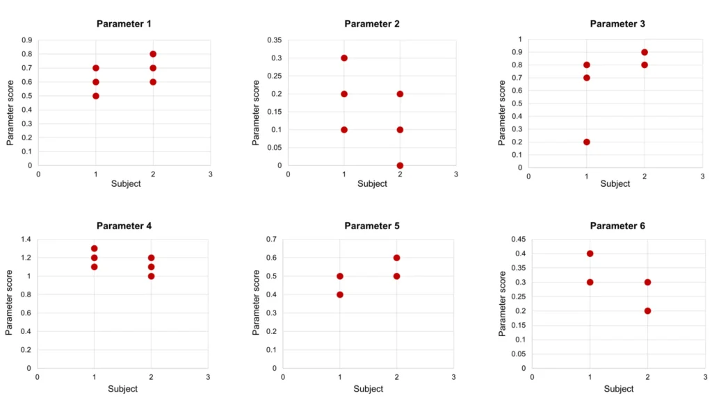
This comparison highlights the advantage of visual representations: they allow for quick identification of trends and anomalies without the need for exhaustive manual review. Graphs like these make it easier to process data holistically and draw insights at a glance, which is particularly valuable during the data cleaning and analysis phases of a clinical trial.
Effective Data Visualization Tips
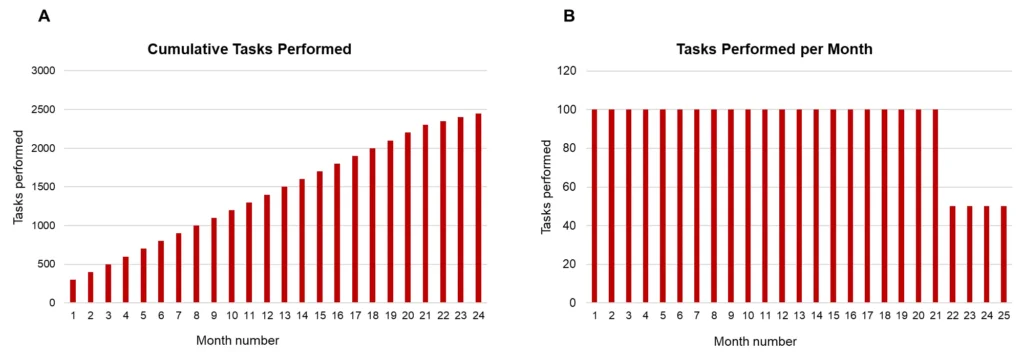
When creating visualizations, it’s essential to display data in ways that highlight relevant patterns and changes over time. Let’s take an example. We need to perform a task 100 times per month. For the first 22 months, we complete the task 100 times per month. After month 22, we reduce it to 50 times per month. To monitor this process, we decide to create a report with a graph showing the progress. We can display the tasks performed so far (Figure 2 panel A) or the number of tasks performed per month (Figure 2 panel B).
In panel B, it is immediately clear that something changes at month 23. While this change is still somewhat visible in panel A, would it be noticeable if the graph only showed data up to month 23? Each bar in Panel B represents only the relevant data for that month (i.e. the number of times the task was performed that month). In contrast Panel A masks the current month’s information with the cumulative results from previous months.
Managing Data for Effective Metrics
A common issue occurs when using data from the entire study to calculate averages, such as the average time to respond to queries. If we rely on data from the entire study period, it will take a significant amount of time before changes in the site’s behavior are noticeable, as earlier data skews the average. The longer the study runs, the harder it is to detect the recent shifts in behavior.
So, how much data should we consider? If we use too little, the metrics may not be representative; if we use too much, current performance can be masked. The solution lies in finding a balance: using enough data to be robust and reliable, but not so much that potential issues remain hidden for an extended period. By carefully choosing the right interval, we can ensure accurate, actionable insights that support timely decision-making.
Choosing the Right Metric for Clear Insights
Choosing the right metric is essential for accurately representing progress and performance. Consider a study with 20 queries: 10 are currently open, 9 of which have been open for over 25 days. To improve responsiveness, we close all queries that have been open for 14 days or more.
If we examine only the “time to close” metric, as shown in Panel A of Figure 3, it may appear that performance worsened after this action. This is because Panel A includes only closed queries and shows the average time it took to close them. After the intervention, when older, long-standing queries were finally closed, the “time to close” increased, skewing the metric and creating a misleading impression of worsened performance, even though the action taken actually improved responsiveness.
Panel B, on the other hand, displays the average time open for currently active queries, offering a clearer snapshot of the current situation. The “after” bar shows that currently open queries have only been open for a few days on average, demonstrating a clear improvement after the intervention and reflecting our responsiveness. This timeframe is well within acceptable limits for open queries in an active study, as queries that are open for less than two weeks are generally not a concern.
Panel C takes it a step further by focusing only on queries that have been open for 14 days or more, providing additional insight into the handling of longer-standing queries. This view can be useful if sponsors have specific concerns about the resolution of older queries, offering an extra level of detail to demonstrate close monitoring.

Data normalization
An important consideration in any data analysis is that data from the different groups should be comparable. The number of adverse events (AEs) from a treatment group with 200 patients is not directly comparable to the number of AEs from a treatment group with 10 patients. Presenting the data on a per-subject basis is likely more appropriate—but is this the right normalization factor?
A normalization factor is generally a measurable quantity that closely correlates with the likelihood of an event occurring. In a study with a fixed number of visits, the average AEs per patient could serve as a good normalization factor, as the number of subjects correlates well with the probability that any subject might experience an AE during the trial. However, in a study with a variable number of visits, this correlation may be weaker, making normalization per patient-month a more suitable choice.
Bringing Related Data Together in One View
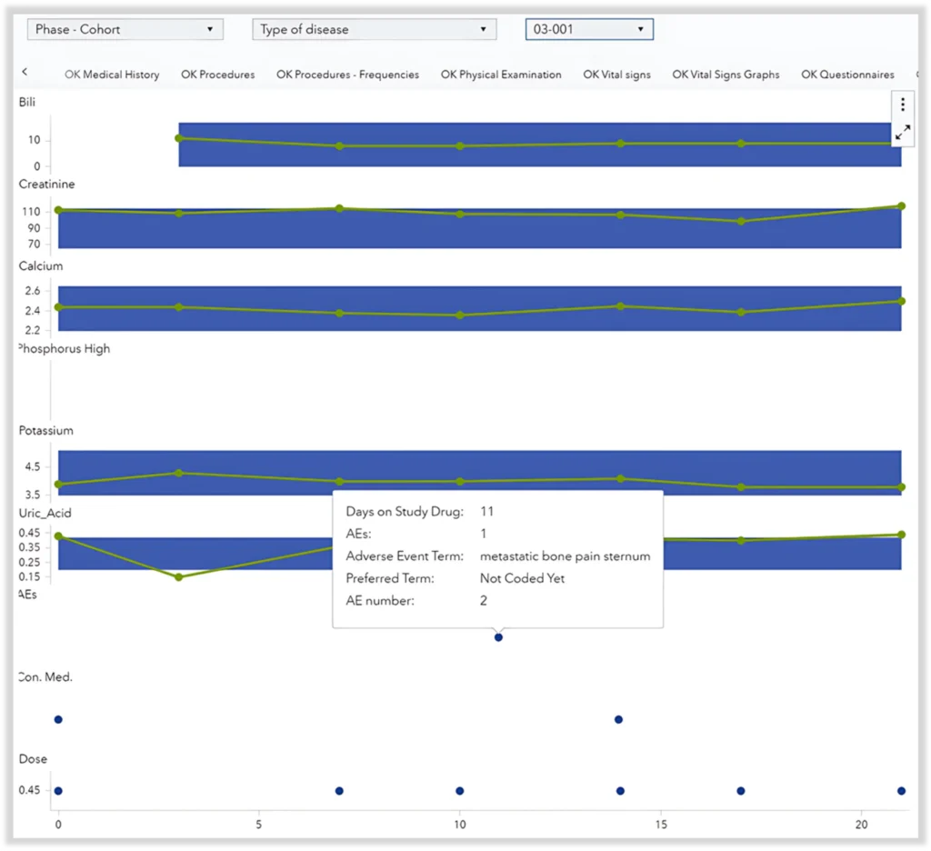
In oncology studies in which the drug is delivered directly into the tumor, the risk of tumor lysis syndrome is always present and must be closely monitored. Tumor lysis syndrome occurs when significant quantities of ions are released in the bloodstream due to cell lysis occurring in the tumor, potentially leading to kidney damage and failure.
To effectively monitor this risk, it is crucial to track ion levels and kidney damage markers (biochemistry), as well as risk factors (medical history and concomitant medication) and any AEs that can be related to high ion levels or kidney damage. These events are particularly relevant when they occur close to the time of the intra-tumoral injection.
Reviewing this information across multiple tables and visuals would be very tedious and inefficient. Instead, having all relevant data in a single comprehensive overview with an indication of when these events occur is far more effective. Figure 4 illustrates this approach.
Combining Graphs and Tables for Comprehensive Insight
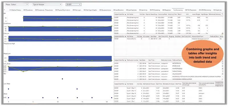
Graphs are powerful tools for illustrating trends and changes over time, but they are limited in the amount of detailed information they can display. Tables, on the other hand, excel at presenting detailed data, but as discussed earlier, are not effective at showing trends or deviation.
For effective monitoring, it is essential to have access to both types of information—trends and detailed data. This can be accomplished by combining graphs and tables into a single visual, as shown in Figure 5. This approach provides a clear overview of trends while also allowing for detailed examination, enabling efficient risk monitoring and informed decision-making.
The figure below is for representation purposes only
Conclusion
In summary, graphical visualizations are powerful tools for gaining insights into the data, allowing trends and anomalies to be spotted without the need to process all the individual numbers. Care must be taken to avoid including irrelevant data that could mask these trends and anomalies. When normalization is required, it is essential to choose a factor that closely correlates with the likelihood of the event of interest occurring.
While graphs are limited in the number of variables they can display, tables excel at presenting detailed information across many dimensions. However, tables are not suitable for trend analysis. To gain a comprehensive understanding of underlying processes, both trends and detailed views are necessary. Combining tables and graphs into a single visual is often the most effective approach for clear and informed data analysis.
For more insights on how clinical data management solution can transform clinical trials, explore our blog, Empowering Small Biotechs: Conquering Clinical Trial Challenges with Data Management Champions. To learn more about our expertise in Clinical Programming and Data Science and how we support your success with tailored solutions, visit our webpage Clinical Programming and Data Science. Let us help you turn complex clinical data into actionable insights.
